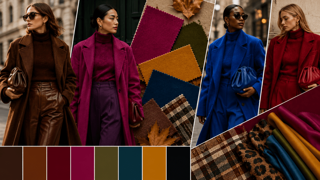
Autumn/Winter 2026 is shaping up to be a season of contrast rather than a return to one dominant colour story. The runways are showing plenty of familiar cold-weather shades, particularly brown, black and deep red, but designers are also introducing brighter accents and more expressive combinations.
Vogue’s analysis of the Fall 2026 collections describes a move toward stronger contrasts, including colour blocking in both vivid and muddy tones, while its womenswear trend forecast identifies rich reds and purples as important alternatives to traditional black.
Pantone’s official New York Fashion Week Autumn/Winter 2026/2027 Fashion Color Trend Report supports this broader picture. Released in February 2026, the report identifies ten standout colours alongside five seasonless shades, describing the season as a balance between earthy, reassuring tones and more energetic colours. Pantone’s official Autumn/Winter 2026/27 colour report
The result is a palette that feels grounded enough for everyday dressing while leaving considerable room for experimentation.
Brown, Red and Black Remain Important
Brown is one of the clearest colour stories for Autumn/Winter 2026. Vogue’s womenswear forecast notes that brown has remained influential across recent seasons and is expected to continue into FW26, with warmer shades such as cinnamon, oak, camel and chestnut gaining visibility. This suggests that brown is not replacing black as a single “new neutral.” Instead, the colour is expanding into a wider family of warm, wearable shades.
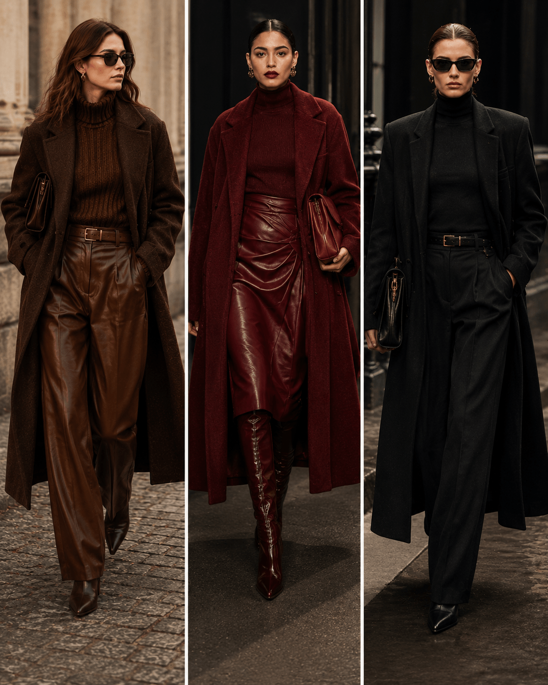
Pantone’s New York palette reinforces that direction with Arabian Spice, a warm earthy brown, Red Mahogany, a rich red-toned brown, and Toffee, a chocolate brown listed among its seasonless shades. These colours make sense for coats, tailoring, leather, knitwear and accessories because they provide the depth associated with winter dressing without depending entirely on black.
Black, however, should not be written off. Vogue’s Milan Fashion Week coverage specifically noted that black dominated many FW26 collections, including Fendi, Dolce & Gabbana, Bottega Veneta and Gucci. This is an important counterpoint to the idea that Autumn/Winter 2026 is simply a bright or colourful season. Black remains a major foundation, but designers are finding ways to make it feel more distinctive through silhouette, texture and contrasting accessories.
Red and purple offer a more expressive alternative. Vogue’s FW26 womenswear forecast identifies rich red and purple as key colours within the season’s “new neutrals” direction, with darker purple-red and carmine tones expected to gain visibility. This makes burgundy, wine, plum and related shades particularly relevant for shoppers who want colour without moving too far away from a sophisticated winter palette.
Pantone Brings Brighter Colour Into the Picture
The most interesting aspect of the Autumn/Winter 2026 palette is the way these dependable shades are being placed alongside brighter colours. Pantone’s ten standout New York Fashion Week colours include Muted Clay, Neptune Green, Green Envy, Arabian Spice, Foxglove, Red Mahogany, Festival Fuchsia, Acacia, All Aboard and Burnt Olive.
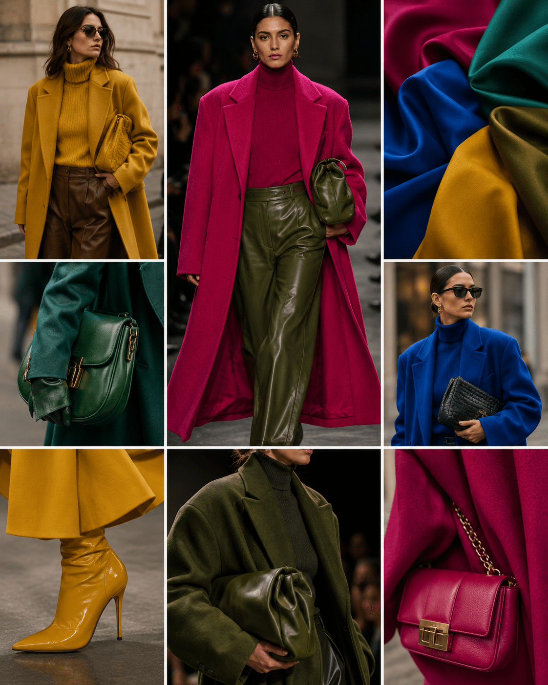
Several of these colours challenge the conventional idea that autumn fashion should be dominated by muted tones. Festival Fuchsia introduces a saturated pink, Acacia brings a green-infused yellow, and All Aboard adds a vivid maritime blue. Neptune Green and Green Envy offer two different interpretations of green, while Burnt Olive provides a more restrained option. Pantone also includes Egret, Candied Ginger, Toffee, Underworld and Poseidon as seasonless foundational shades, giving the brighter colours a practical base to work against.
Vogue’s reporting from individual Fall 2026 collections shows that this mixture is not limited to colour forecasting. At Theory, for example, the palette included rusty orange, pale grey-blue and olive, with vivid magenta used as an accent. A.L.C. similarly combined traditional autumnal colours with unexpected mint and red. These examples suggest that the more useful interpretation of the trend is not to replace neutrals with bright colour, but to use unexpected shades to interrupt an otherwise familiar wardrobe.
Colour Blocking and Expressive Combinations
Colour blocking is another important part of the story. Vogue’s review of the Fall 2026 collections identifies colour blocking as a notable trend, with designers combining both bright and muddy shades rather than restricting themselves to monochrome dressing.
Vogue’s recent coverage of the wider return to colour also points toward combinations such as tomato red with plum and brown, or pool blue with navy, showing how contrasting colours can become the foundation of an outfit rather than simply an accessory detail.
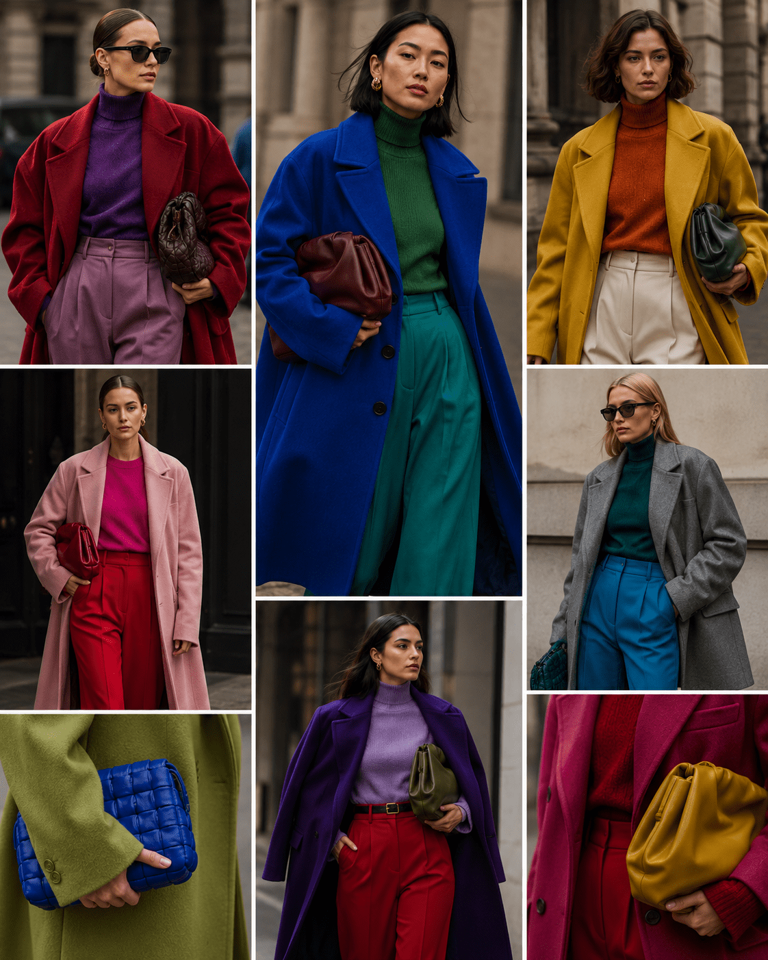
For everyday wardrobes, this makes the season surprisingly adaptable. A brown coat can be worn with burgundy or plum, while a navy or deep blue knit can be paired with a brighter green. Those who prefer a quieter approach can introduce Festival Fuchsia, Acacia or red through a handbag, scarf, shoe or knitwear piece rather than wearing the colour head to toe.
The important point is that Autumn/Winter 2026 does not require abandoning the traditional winter palette. Instead, the strongest direction is the interaction between dependable colours and unexpected ones. A neutral foundation gives a vivid shade context, while a brighter colour can make familiar pieces feel new.
A Colour Palette Built Around Contrast
The evidence from Pantone, Vogue and current fashion coverage points toward a more nuanced colour story for Autumn/Winter 2026. Brown remains highly relevant, black continues to dominate many collections, and red and purple are gaining importance as sophisticated alternatives to conventional neutrals. At the same time, greens, maritime blues, fuchsia and yellow introduce the experimentation that prevents the season from feeling overly restrained.
Rather than searching for one definitive “colour of Autumn/Winter 2026,” it makes more sense to think in terms of a flexible palette. The strongest wardrobes will combine grounded shades with carefully chosen accents, allowing colour to influence the mood of an outfit without dictating its entire identity.
For anyone following the season’s trends, that may be the most useful forecast of all. Autumn/Winter 2026 is not about choosing between neutral dressing and bold colour. It is about making the two work together, using familiar winter shades as a foundation for a more expressive approach to fashion.